
UPS Website Redesign
This report would evaluate the usability of the United Parcel Service (UPS) website comparing it with one of its biggest competitors in the market FedEx. UPS and FedEx are the world's largest multinational shipping & receiving and supply chain management companies.
The existing User Interface of the United Parcel Service (UPS) website lacks a primary flow, it has some disturbing elements as well as the focus area on the website has been wrongly divided.
Role
UX Designer
UX Analyst
Team
UX Designer
UX Analyst
Duration
1 month
UPS Website Redesign
Role
Product Designer
Team
1 Product Manager
1 Product Designer
4 Engineers
1 Project Co-ordinator
Company
Soluis
Duration
6 months
UPS Website Redesign
This report would evaluate the usability of the United Parcel Service (UPS) website comparing it with one of its biggest competitors in the market FedEx. UPS and FedEx are the world's largest multinational shipping & receiving and supply chain management companies.
The existing User Interface of the United Parcel Service (UPS) website lacks a primary flow, it has some disturbing elements as well as the focus area on the website has been wrongly divided.
Role
UX Designer
UX Analyst
Team
UX Designer
UX Analyst
Duration
1 month
UPS Website Redesign
Role
Product Designer
Team
1 Product Manager
1 Product Designer
4 Engineers
1 Project Co-ordinator
Company
Soluis
Duration
6 months

Aim & Objective
Through the evaluation I seek to improve the UPS website by comparing its usability with FedEx’s site through A/B testing. It involves assessing performance and satisfaction across tasks, analysing user behaviour, identifying issues, and providing design recommendations and prototypes for improvement.
I used the following methods to enhance the evaluation:
• Pilot Testing - To effectively plan out the time on each task.
• Participant Recruiting Survey - To understand the participants profile and demographics and their willingness, availability and preferred mode for the test.
• Introductory Survey - To obtain the participant's consent and gain a deeper understanding of their ideas about the business.
• Think Aloud - To understand the participant’s thoughts on the website.
• Task design - To highlight the issues with the UI and UX of the UPS website.
• Product Reaction Cards - The cards help in understanding the difference between the user experience and feeling about the two websites.
• SUS+Credibility+NPS Questionnaire - To measure the satisfaction of users
• A short Interview to end the test - To get feedback from participants on the tasks and overall user journeys.

Testing with five people allows to identify almost as many usability issues as testing with many more people. Whether you're testing websites, intranets, PC applications, or mobile apps, it doesn't matter.
Testing with five people allows to identify almost as many usability issues as testing with
many more people. Whether you're testing websites, intranets, PC applications, or mobile apps, it doesn't matter.
Task & Goals
Task & Goals
Testing with five people allowed. me to identify almost as many usability issues as testing with many more people. Whether you're testing websites, intranets, PC applications, or mobile apps, it doesn't matter.
Task & Goals
Opportunity Areas
Overall Findings
Overall Findings
The research revealed that the FedEx website delivered a more effective, efficient, and positive user experience compared to UPS. Key findings include:
Error Counts: UPS had consistently higher error counts during tasks compared to FedEx.
Assist Counts: UPS required more assistance for all tasks, whereas FedEx required minimal assistance.

System Usability Scale SUS:
The SUS scores determined that the user satisfaction on the FedEx website (Mean SUS score: 88) was much higher than that on the UPS website (Mean SUS score: 20.5).

Net Promoter Scale NPS: The NPS scores determined that participants had a positive experience on FedEx and a negative experience on the UPS website and there did not want to recommend it further.
System Usability Scale SUS: The SUS scores determined that the user satisfaction on the FedEx website (Mean SUS score: 88) was much higher than that on the UPS website (Mean SUS score: 20.5).

User Interface - Credibility: The scores determined that participants had a positive thoughts for the user interface design of FedEx which were a contrast to their thoughts about the interface design of the UPS website.
Net Promoter Scale NPS:
The NPS scores determined that participants had a positive experience on FedEx and a negative experience on the UPS website and there did not want to recommend it further.
User Interface - Credibility:
The scores determined that participants had a positive thoughts for the user interface design of FedEx which were a contrast to their thoughts about the interface design of the UPS website.
Usability Issues
Issues during Task 1 : Find the nearest drop-off point.
Issue No 1A: Location button on the top right corner is not really visible.
Issue No 1B: Location button on the top right corner looks like an option to change the geographical location rather than the tab to find the nearest drop off points.
Issue No 1C: After adding the Pincode for the city the drop off points were not getting filtered out for that particular place.

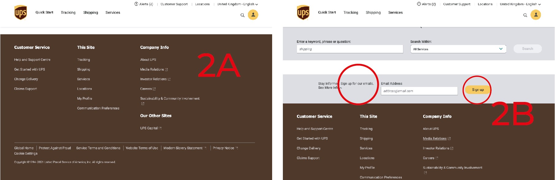
Issues during Task 2: Sign-up for regular emails without creating an account.
Issue No 2A: Option to SignUp for Emails not available in all the footers.
Issue No 2B: The words signup for emails were misleading and confusing as in one place it was written sign up while in the other sign up for mails.
Issues during Task 3: Find out about the cost of a shipment.
Issue No 3A: Too many details required to find out the cost.
Issue No 3B: Details were asked in two steps, which was confusing for the users.
Issue No 3C: Different phrases in different places were used to reach the calculate cost of a shipment page.

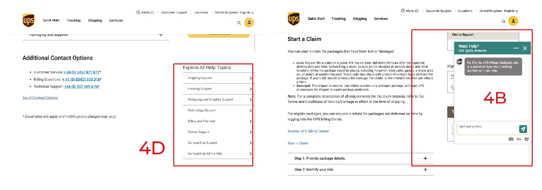
Issues during Task 4: Find out the time it takes to process claim.
Issue No 4A: No FAQ Section on the Website
Issue No 4B: The Chatbot kept popping without clicking on it.
Issue No 4C: The customer support section was disorganised and confusing.
Issue No 4D: The subtopics were listed on the right side which is mostly unnoticed on websites.
Issues during Task 5: Find out about the return services and compare the different available services.
Issue No 5A: Return Services not available under shipping.
Issue No 5B: Return services was very difficult to find.
Issue No 5C: Shipping services not available under the shipping menu.
Issue No 5D: The subtopics were listed on the right side which is mostly unnoticed on websites.

Issues during Task 6: Find out the list of restricted items for shipping.
Issue No 6A: Not mentioned anywhere under shipping.
Issue No 6B: Very complicated flow to reach the details
Issue No 6C: The subtopics listed on the right side which is mostly unnoticed.
Issue No 6D: The tab for the got hidden because of the popping up of chatbot.

Issues during Task 7: Find out about the sustainability of the service.
Issue No 7A: Not available under about UPS section.
Issue No 7B: To much information made it difficult to find the information
Issues during Task 7: Find out about the sustainability of the service.
Issue No 7A: Not available under about UPS section.
Issue No 7B: To much information made it difficult to find the information

The usability test provided measurements and insight into some obvious flaws with the UPS website's design and experience when compared against FedEx. The experimental design procedure, or extended way to CIF, helped in analysing the efficacy, efficiency, and satisfaction between the two websites' experiences, and so achieving the research's aim.
The usability test provided measurements and insight into some obvious flaws with the UPS website's design and experience when compared against FedEx. The experimental design procedure, or extended way to CIF, helped in analysing the efficacy, efficiency, and satisfaction between the two websites' experiences, and so achieving the research's aim.
The evaluation revealed that FedEx performed far better in terms of efficiency, effectiveness, and satisfaction during the tasks done on the two websites than UPS. As a result, re-design recommendations were made in order to improve the website's user experience and user interface.
Formative Evaluation and User Goals
Formative Evaluation and User Goals
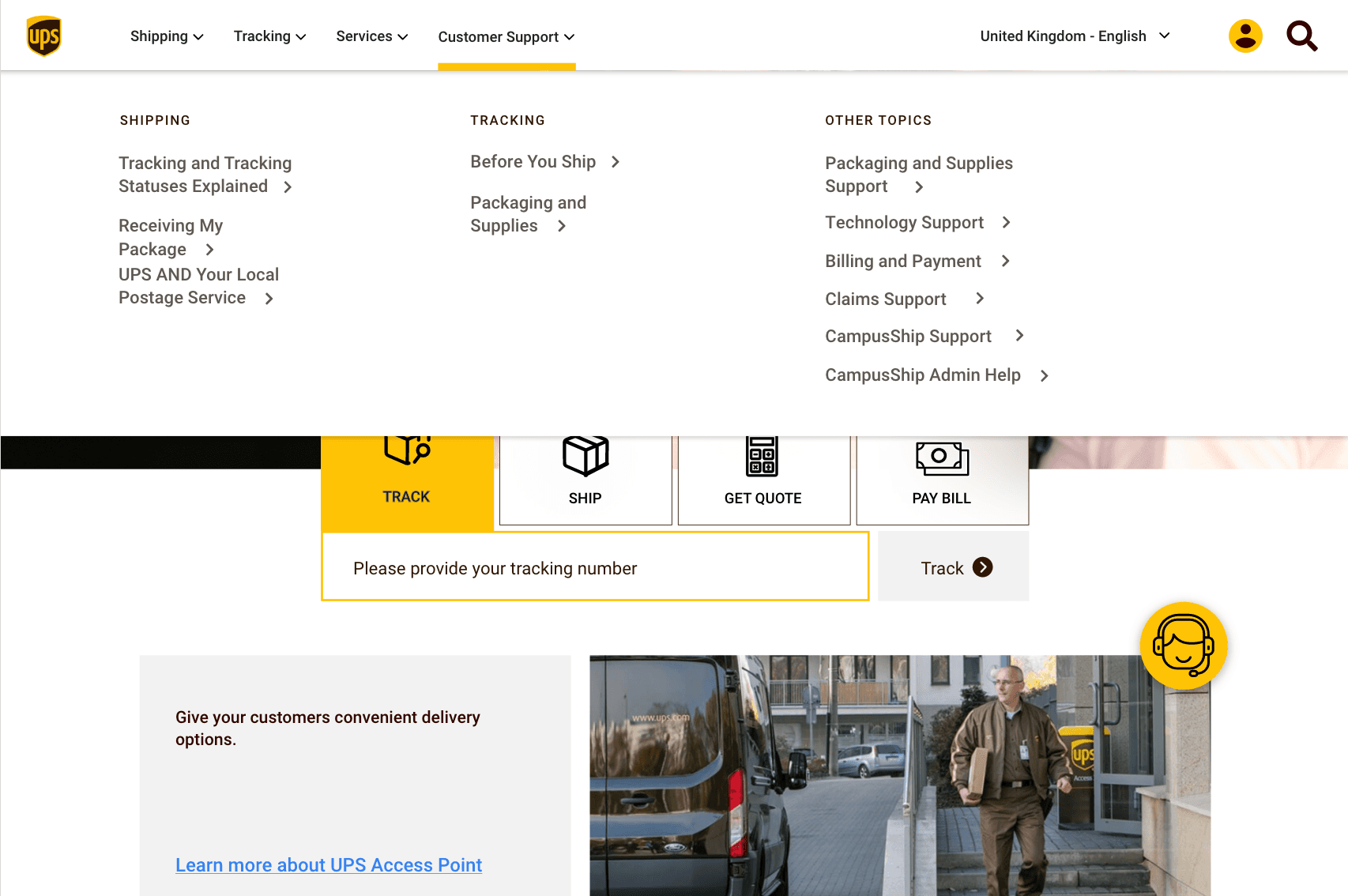
The identified key issues were summarized with a list of redesign recommendations based on the usability test results for the UPS website.
By creating user flows, the product's required structure and hierarchy for different offerings became clear. To ensure a smooth development process,
I involved a developer to identify any potential tech constraints early on.
By creating user flows, the product's required structure and hierarchy for different offerings became clear. To ensure a smooth development process,
I involved a developer to identify any potential tech constraints early on.

Revised website
Revised website
Measuring Impact
Measuring Impact
| The time on tasks reduces on addition of the primary flow.

| Track primary flow

| Adding the drop down menu of customer support section makes it easier for users to locate Important topics people would need support in.
Reflecting upon project outcomes
Reflecting upon project outcomes
Understanding User Behaviour
I've learned that variations in a website's structure and design can strongly influence user behaviour, including navigation styles, frequency of interaction, and the duration spent on various components.
Data-Driven Decisions
I realised the significance of evidence-based findings to decide on the right design implementation, guaranteeing that alterations are backed by measurable proof instead of assumptions.